A Beautiful Boilerplate for Responsive, Mobile-Friendly Development
What Is It?
Skeleton is a small collection of CSS & JS files that can help you rapidly develop sites that look beautiful at any size, be it a 17" laptop screen or an iPhone. Skeleton is built on three core pieces:

Responsive Grid Down To Mobile
Skeleton has a familiar, lightweight 960 grid as it's base, but elegantly scales down to downsized browser windows, tablets, mobile phones (in landscape and portrait). Go ahead, resize this page!

Fast to Start
Skeleton is a tool for rapid development. Get started fast with CSS best practices, a well-structured grid that makes mobile consideration easy, an organized file structure and super basic UI elements like lightly styled forms, buttons, tabs and more.
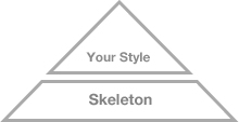
Style Agnostic
Skeleton is not a UI framework. It's a development kit that provides the most basic styles as a foundation, but is ready to adopt whatever your design or style is.
The Grid
Skeleton's base grid is a variation of the 960 grid system. The syntax is simple and it's effective cross browser, but the awesome part is that it also has the flexibility to go mobile like a champ. Go ahead, resize the browser and watch as the layout reacts!
Typography
The typography of Skeleton is designed to create a strong hierarchy with basic styles. The primary font is the classic Helvetica Neue, but the font stack can be easily changes with just a couple adjustments. Regular paragraphs are set at a 14px base with 21px line height.
Heading <h1>
Heading <h2>
Heading <h3>
Heading <h4>
Heading <h5>
Heading <h6>
This is a blockquote style example. It stands out, but is awesome
Dave Gamache, Skeleton Creator
Buttons
Buttons are intended for action and thus should have appropriate weight. The standard button is given that weight with a little bit of depth and a strong hover.
Click Me For ActionTabs
Some very simple tabs that have dead simple jQuery that hook them up to their corresponding content.
- The tabs are clean and simple unordered-list markup and basic CSS.
- The tabs are cross-browser, but don't need a ton of hacky CSS or markup.
- The tabs work like a charm even on mobile devices.
Forms
Forms can be one of the biggest pains for web developers, but just use these dead simple styles and you should be good to go.
Media Queries
Skeleton uses a lot of media queries to serve the scalable grid, but also for the convenience of styling your site on different size screens. Skeleton's media queries are almost exclusively targeted at max and min widths rather than device sizes or orientations. The advantage of this is browsers and future mobile devices that don't map to exact set dimensions will still benefit from the styles. That being said, all of the queries were written to be optimal on Apple iOS devices. The built in media queries include:
- iPad Portrait or any other tablet device
- iPhone or mobile styles in general for small screens
- iPhone Landscape or other mobile devices with a large screen size (cascades over standard mobile styles)
- Less than 960 to style anything across browsers and devices that is smaller than the base grid
The Future
As I write this, Skeleton is unreleased and I have just started using it in personal projects. In the future, I hope to build a small community around Skeleton - I want to get feedback, make it better and find the holes.
The ultimate goal is to build the best starting point for front-end development with an emphasis on simple, device-agnostic design.t Help me get there - check out the project on Github or just email me - dhgamache [at] gmail.com - with questions/suggestions.
Download
The Skeleton download is a zip file (~50kb) containing all the CSS groundwork and JS goodies to get started on any web project.
Download Skeleton 1.0View Source on Github
The file structure for Skeleton is:
- index.html: The base html page that includes the necessary initial markup
-
stylesheets (folder)
- base.css: Basic styles of Skeleton
- skeleton.css: The glorious Skeleton grid
- layout.css: Empty file made for your site specific styles
- ie.css: Empty CSS file for IE specific needs
-
javascripts (folder)
- jquery-1.5.1.min.js: jQuery is served the Google CDN, but I've provided a local fallback
- app.css: Contains code for activating tabs and should house all of your sites JS
- Plugins (folder): An empty directory for your jQuery plugins
- images (folder)
- robots.txt: SEO, search-crawler file. Don't need to touch it, just there for your own good
- 404.html: Placeholder 404 page just to get you started
Created by Dave Gamache, 2011 ©