A Beautiful Boilerplate for Responsive, Mobile-Friendly Development
TweetWhat Is It?
Skeleton is a small collection of CSS files that can help you rapidly develop sites that look beautiful at any size, be it a 17" laptop screen or an iPhone. Skeleton is built on three core principles:

Responsive Grid Down To Mobile
Skeleton has a familiar, lightweight 960 grid as its base, but elegantly scales down to downsized browser windows, tablets, mobile phones (in landscape and portrait). Go ahead, resize this page!

Fast to Start
Skeleton is a tool for rapid development. Get started fast with CSS best practices, a well-structured grid that makes mobile consideration easy, an organized file structure and super basic UI elements like lightly styled forms, buttons, tabs and more.
Style Agnostic
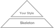
Skeleton is not a UI framework. It's a development kit that provides the most basic styles as a foundation, but is ready to adopt whatever your design or style is.
The Grid
Skeleton's base grid is a variation of the 960 grid system. The syntax is simple and it's effective cross browser, but the awesome part is that it also has the flexibility to go mobile like a champ. Go ahead, resize the browser and watch as the layout reacts!
Typography
The typography of Skeleton is designed to create a strong hierarchy with basic styles. The primary font is the classic Helvetica Neue, but the font stack can be easily changed with just a couple adjustments. Regular paragraphs are set at a 14px base with 21px line height.
Heading <h1>
Heading <h2>
Heading <h3>
Heading <h4>
Heading <h5>
Heading <h6>
This is a blockquote style example. It stands out, but is awesome
Dave Gamache, Skeleton Creator
Buttons
Buttons are intended for action and thus should have appropriate weight. The standard button is given that weight with a little bit of depth and a strong hover.
Click Me For ActionForms
Forms can be one of the biggest pains for web developers, but just use these dead simple styles and you should be good to go.
Media Queries
Skeleton uses a lot of media queries to serve the scalable grid, but also for the convenience of styling your site on different size screens. Skeleton's media queries are almost exclusively targeted at max and min widths rather than device sizes or orientations. The advantage of this is browsers and future mobile devices that don't map to exact set dimensions will still benefit from the styles. That being said, all of the queries were written to be optimal on Apple iOS devices. The built in media queries include:
- Smaller than 960: Smaller than the standard base grid
- Tablet Portrait: Between 768px and 959px
- All Mobile Sizes: Less than 767px
- Just Mobile Landscape: Between 480px and 767px
- Just Mobile Portrait: Less than 479px
Support for Skeleton
Skeleton has been tested across as many devices and browsers as I could get my hands on:
- Latest Chrome (Mac/PC)
- Firefox 4.0, 3.6, 3.5, 3.0 (Mac/PC)
- Latest Safari
- IE9, IE8, IE7
- iPhone (Retina)
- Droid (Charge/Original)
- iPad
There is a small hiccup though - older non-CSS3 browsers aren't going to respond to the media-queries and thus will be served the standard 960 grid even if they are resized. In the spirit of graceful degradation though, I'm going to let this be instead of trying to implement a JS solution. If you are interested in one though, try the respond.js polyfill.
Notes on IE: We all know sometimes IE doesn't behave, so through the genius of conditional CSS I've added a class of "ie" to all versions of the browser, as well as specific targets for each (i.e. "ie6", "ie7", "ie8"). It's not a perfect world, but hopefully this will help make naughty IE behave.
Examples & Extensions
Skeleton has been in the wild for quite a few months now and reception has been pretty awesome so far. Nothing pleases me more than receiving emails about projects using Skeleton or constructive feedback (this is really the reason Skeleton gets better). Here is a quick list of some of the most awesome sites using Skeleton:
Skeleton also has been extended in a number of ways! These are the extensions I've heard of so far!
Downloads
The Skeleton download is a zip file (~25kb) containing all the CSS groundwork to get started on any web project.
Download Skeleton 1.2 from Github Download Skeleton PSD TemplateThe file structure for Skeleton is:
- index.html: The base html page that includes the necessary initial markup
-
stylesheets (folder)
- base.css: Basic styles of Skeleton
- skeleton.css: The glorious Skeleton grid
- layout.css: File with no specific styles, but a variety of useful media queries
-
images (folder):
- favicon.ico: Standard 16x16 favicon
- apple-touch-icon (x3): All three sizes of Apple touch icons for iPhone 3, iPad and iPhone 4 with retina.
License & Log
All parts of Skeleton are free to use and abuse under the open-source MIT license. The full licensing language can be found here: http://www.opensource.org/licenses/mit-license.php. More importantly, I would love to have a small community of contributors to Skeleton, so please feel free to jump over the Skeleton Github page and contribute to make Skeleton a better boilerplate for everyone!
A brief log of the history of Skeleton
- V1.0.0 (5/15/2011): Initial release of Skeleton.
-
V1.0.1 (5/19/2011): Made some quick changes based on input from Github and fellow designers.
- Refined the app.js to make faster and cleaner
- Added Apple touch icons
- Removed some bloated CSS lines from the base.css
- Added an :active button class
- Changed Skeleton favicon
- Added MIT licensing
- V1.0.2 (5/20/2011): Added more input declarations to the .button styles and included legend in CSS
- V1.0.3 (7/17/2011): Fixed the issue of failed "zooming" on browsers.
-
V1.1 (8/17/2011): A lot of cleanup changes. I finally feel comfortable throwing a 1.1 on this bad boy.
- App.js is now just tabs.js
- Tab CSS now works perfectly on IE7+
- Rewrote layout.css media-query spaces to be easier to understand
- Stripping some rogue whitespace and reformatting a bit
- Fixing broken doctype declaration
-
V1.2 (6/20/2012): Pruning Skeleton down to some more bare bones :)
- Remove tabs and all JS
